
It allows you to content-enable applications, from mobile apps to single-page applications, billboards, embedded devices and more. Rich application programming interfaces (APIs) let developers place content wherever it is needed, and the zero-configuration, embedded content delivery network (CDN) ensures high performance and global scale. An intuitive user interface (UI) lets marketers make updates more quickly with cognitive tagging help transform disorderly assets into a searchable library.
Create a site with CMS
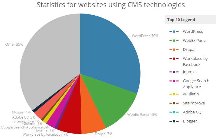
Content Management System
that powers digital experiences!
65% Websites On Internet are using CMS

Responsive Web Design

RWD is an approach to web design aimed at allowing desktop webpages to be viewed in response to the size of the screen or web browser one is viewing with. In addition, it is important to understand that responsive web design tasks include offering the same support to a variety of devices for a single website. Recent work also considers the viewer proximity as part of the viewing context as an extension for RWD. Content, Design and Performance are necessary across all devices to ensure usability and satisfaction.
A site designed with RWD adapts the layout to the viewing environment by using fluid, proportion-based grids, flexible images, and CSS3 media queries, an extension of the @media rule, in the following ways:
- The fluid grid concept calls for page element sizing to be in relative units like percentages, rather than absolute units like pixels or points.
- Flexible images are also sized in relative units, so as to prevent them from displaying outside their containing element.
- Media queries allow the page to use different CSS style rules based on characteristics of the device the site is being displayed on, most commonly the width of the browser.
Responsive web design has become more important as the amount of mobile traffic now accounts for more than half of total internet traffic. Therefore, Google announced Mobilegeddon in 2015, and started to boost the ratings of sites that are mobile friendly if the search was made from a mobile device. Responsive web design is an example of user interface plasticity.
Mobile first, unobtrusive JavaScript, and progressive enhancement
“Mobile first”, unobtrusive JavaScript, and progressive enhancement are related concepts that predate RWD. Browsers of basic mobile phones do not understand JavaScript or media queries, so a recommended practice is to create a basic web site and enhance it for smart phones and PCs, rather than rely on graceful degradation to make a complex, image-heavy site work on mobile phones.
My Offer WebSite Essentials
- Responsive Web Design
- Server hosting
- Security & Anti-spam protection
- 12 month administration (updates install, small fixes)
- Basic SEO
- 4 Menu items management
- IT Consulting
- Site documentation
- Speed optimization
- Quality certificate
- Testimonials